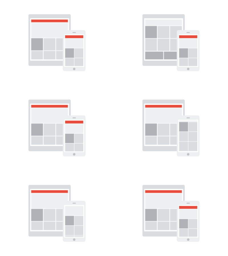
Is the hottest term trending the email marketing landscape at the moment. This leaves many with the question, what is responsive email? Well, the main reason why it seems to be gaining steam among online businesses is because a responsive design adapts to whatever device it is being viewed on. This becomes especially handy for those businesses who look to achieve a better result on mobile and other hand held devices.
The following are some of the tips for getting a responsive email design
Lose the Sidebar
It is important to remember that in a mobile device, everything becomes longer and of course, narrower. This will make something like a sidebar look something like a line. Another thing with emails is that it is obviously going to have a lot of text. Emails on mobile devices look best in a single column. If you do need to use multiple columns, keep the content short so that the columns look like the grid.
Make Links and Buttons Bigger
Picture this; you’re browsing on your phone, and tap on a link. You expect to go to a certain webpage, but instead you end up somewhere else, reason? Because the buttons were so small you tapped on the wrong one, this is the reason why you should be making your links and buttons big enough for people to see them properly. Regardless of whether it’s a link or a CTA button, always go for 44 x 44 pixels.
Invert the Pyramid
Just like any other copy, you would want to write in an inverted pyramid style, that is, putting the most important information first. Since most viewers quit reading somewhere in the middle, make sure you add everything you think the client needs to know in the first two paragraphs. Of course, you still want them to scroll down and read the whole thing. To do that you can always add a teaser in the heading or subject line. That should get the readers to scroll.
Start from the Leg Up
It is important for businesses to use a “mobile first” approach. This means, beginning with the mobile experience and working up to desktop. That being said, there are no fixed rules when it comes to responsive email templates, but going for a mobile approach instead of trying to retrofit your website is a better choice.
The effort required to code an email for responsive design is intensive and most marketers also complain of breakage when their designs are viewed in unsupported email clients and web browsers. This is why only hiring the best in the business will help you get the most out of your marketing campaign, and that also goes for email newsletters as well. If you’re send email newsletters, it’s more than likely that a growing percentage of those subscribers are reading your content on their mobile devices. So, the obvious thing to do would be to design it for those hand-held devices.
Ending Note
Mobile optimization is not a cheap endeavour and some coins will need to be dropped if you want to play with the big boys, but it’s also not crazy expensive either. So, to make it easier for the consumers to view your email in their inbox.

